This blog post illustrates a few questions about the relationship that The Voyant has with articles such as “The Crisis”. The Voyant is a website that allows a visual representation of the most common words used in a piece of work. A few of the various ways that this data can be represented is in screenshots below, and it is crucial to analyzing pieces of text because it allows the scientist to have an easier way of interpreting and organizing data. I believe this is extremely important because the collection of visual data can be useful in starting a theme for a piece of work. This data can not only answer historical questions about the setting of when “The Crisis” was created, but can also provide evidence for other historical artworks and future works.
For this post, the main questions to focus on are how the usage of certain words impacts the overall message of this article. Without knowing anything about the article, what can we infer that “The Crisis” is about? Another way of asking this question would be: How does text visualization allow scientists and others to understand the meaning of an article? What kind of advantages and disadvantages to The Voyant can we conclude by answering this question?
The methods I used to prepare this blog post was through the readings of “The Crisis” and utilizing screenshots from The Voyant. Uploading a TEI file into The Voyant is the simplest way of achieving this data. The full text can be seen in the middle of the page after uploading the file, but the most important information for analyzing a piece of work will be to the left and right as well as below the overall text. To the left is the visual way of seeing the most commonly used words in the text and to the right are the graphical viewpoints of these words used throughout the text. The summary can be found below all of the above, but I did not use that information because it only gives the basis of what we are looking at for this post. I will use the information in the summary throughout these conclusions in order to pinpoint every aspect of The Voyant.
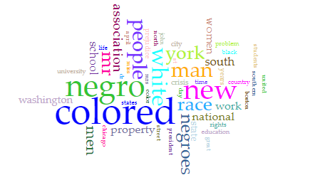
Figure 1 above is a screenshot taken of the Cirrus of most of the commonly used words in “The Crisis”. Each word has a different color that doesn’t have any correlation – it seems to just be random – but this is helpful because it differentiates between all words and isn’t bland to look at. The larger the word is, the more commonly it is used in the text. Therefore, the most commonly used word is “colored”, with “negro”, “new”, “white”, and “people” close by.
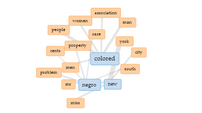
Figure 2 is the screenshot above showing the links between the three most commonly used words – in blue – and the multiple other words – in orange – that are oftentimes next to each other throughout “The Crisis” articles. The most commonly used independent words are “colored”, “negro”, and “new” – similar to Figure 1 – but the grey lines indicated the words that these three are often connected to and follow after.
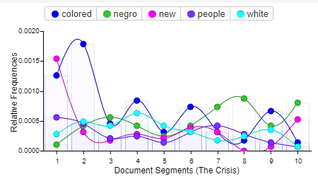
Figure 3 shown above is the relative frequency of a few of the most frequently used words throughout the articles. The difference between this figure and the previous figures is that this graph shows when the words are used in the text, not just what the words actually are. This information can show an important trend of what the articles are discussing. For example, at the beginning of the articles we can infer that the word “colored” is used more often than the rest of the piece work.
Question 1: Without knowing anything about the article, what can we infer that “The Crisis” is about?
I think the important thing to look at is the relationship between these three figures and how they work hand in hand with each other. Figure 1 is the formation of the most important and frequently used words in the text. Figure 2 are the connections between a few of the most important words from Figure 1 and other commonly used words. This information is important as well because the articles often include the phrases “colored people” or “New York”. The knowledge of this can eliminate the confusion of individual words and even create a more focused conclusion on words/phrases most important in these articles. Finally, Figure 3 uses some of the same words as Figures 1 and 2 in order to visually represent the occurrences of each word and which of the words occurs in the text the most. Sometimes, a certain word is used more frequently in the beginning middle or end of the text rather than others. Without knowing anything about “The Crisis”, the large frequencies of the words from Figure 1, the connections of Figure 1 to Figure 2 – going from only the word “colored”, which can have multiple meanings, to more frequently “colored people”, and the title name itself can conclude that these articles have to do with the social, economic and political crisis between African Americans and whites in the New York area.
Question 2: What kind of advantages and disadvantages to The Voyant can we conclude by answering the previous question?
I personally believe there are more advantages than disadvantages towards the utilization of The Voyant in answering the thematic question in the previous paragraphs. The three figures of data allow for an easier way of analyzing word usage and connecting to an extremely broad theme of a large piece of text. Although Figure 2 was able to create the actual links between words from Figure 1 and clearing up confusion on how these words could be used in these articles, we are not entirely sure of the way these words are used unless we read “The Crisis” from beginning to end. Figure 3 is difficult when answering question 1 because the timestamps of when the most common words are used doesn’t correlate with the theme of the text. However, it is another beneficial way of storing data.
I agree with what you siad about the advantage and disadvantage about the Voyant. And I think the most and useful advantage about the tool is accessibility. It is easy to use, just upload the file and everything will be generated automatically.
I love your layout for thoroughly explained how Voyant help and improve data visualization. Especially for this topic of The Crisis, you demonstrated really well of different data shown on various ways in Voyant. It expressed different effects while demonstrating different method of showing data visually. I really appreciate your work.